
KOSA is a premium tea brand inspired by nature, craftsmanship, and the ritual of slow living. The brand was created to elevate everyday tea moments through thoughtfully curated blends and refined design.
The identity combines immersive landscape imagery, premium packaging, and a calm visual language to create a distinctive and memorable brand experience. Each blend reflects its origin and ingredients, celebrating tea as a moment of connection, presence, and discovery.
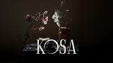
Kosa
More than tea. A ritual shaped by nature, place, and time.
Brand Identity
Logo Design
Packaging Design
Art Direction
Visual System
Brand Strategy


The Visual Identity
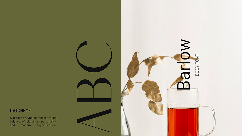
The visual language of KOSA is rooted in the landscapes, ingredients, and moments that shape each blend. Earthy greens, warm neutrals, honey golds, and rich botanical tones are drawn from tea-growing regions and natural ingredients, creating a palette that feels both grounded and refined. Paired with atmospheric imagery and quiet moments of ritual, these elements evoke a sense of stillness, authenticity, and timeless connection to nature.

The Strategy
A Brand Built Around Ritual
KOSA’s strategy was built around redefining tea as more than a beverage. It is a ritual of presence. Through research into tea culture, ingredient origins, and evolving consumer preferences, the brand was positioned at the intersection of nature, craftsmanship, and mindful living. This foundation informed every aspect of the identity, from a nature-inspired color palette drawn from landscapes and ingredients to distinctive typography that balances elegance with character. Atmospheric illustrations and immersive visuals further reinforce a sense of place, transforming each blend into a story of origin. Together, these elements create a premium and timeless brand experience that turns everyday tea moments into meaningful rituals.


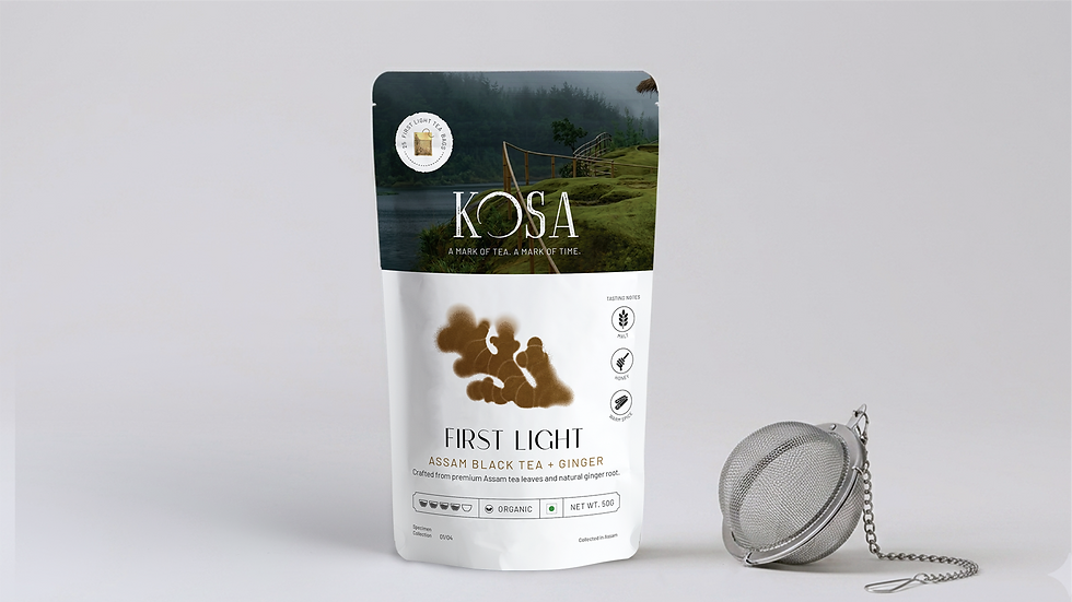
The Packaging
KOSA’s packaging is designed as a window into the world of each blend. While a consistent structure creates recognition across the range, every pack tells a unique story through its imagery, ingredients, and sense of place. Expansive landscapes, atmospheric lighting, and ingredient-led illustrations transform each blend into an immersive visual experience.
Rather than simply describing flavor, the packaging captures the mood, origin, and character of the tea, from mist-covered mountains and golden tea fields to blooming botanicals and quiet moments of ritual. This balance of consistency and storytelling creates a system that feels cohesive, collectible, and distinctly KOSA.


Finding Our Mark
In a crowded tea market, the challenge was to create a brand that felt both premium and meaningful. KOSA needed to move beyond product-focused communication and establish an emotional connection through ritual, origin, and storytelling.
Finding Our Mark
In a crowded tea market, the challenge was to create a brand that felt both premium and meaningful. KOSA needed to move beyond product-focused communication and establish an emotional connection through ritual, origin, and storytelling.
